 Get in touch
Case study · MTN Nigeria
One design system for MTN Nigeria's products.
Two portals, built by the same team: two logos, two sidebars, two button styles and two ways of showing status. For a customer, every product meant relearning the basics.
Customers noticed the inconsistencies across MTN's apps, and internal teams saw them too. People also raised the issue on social media.
So we started with an audit. Each of us took a set of screens and audited them alongside the designers on that product, and we pulled everything together in FigJam. Some differences only showed up when we inspected the values.
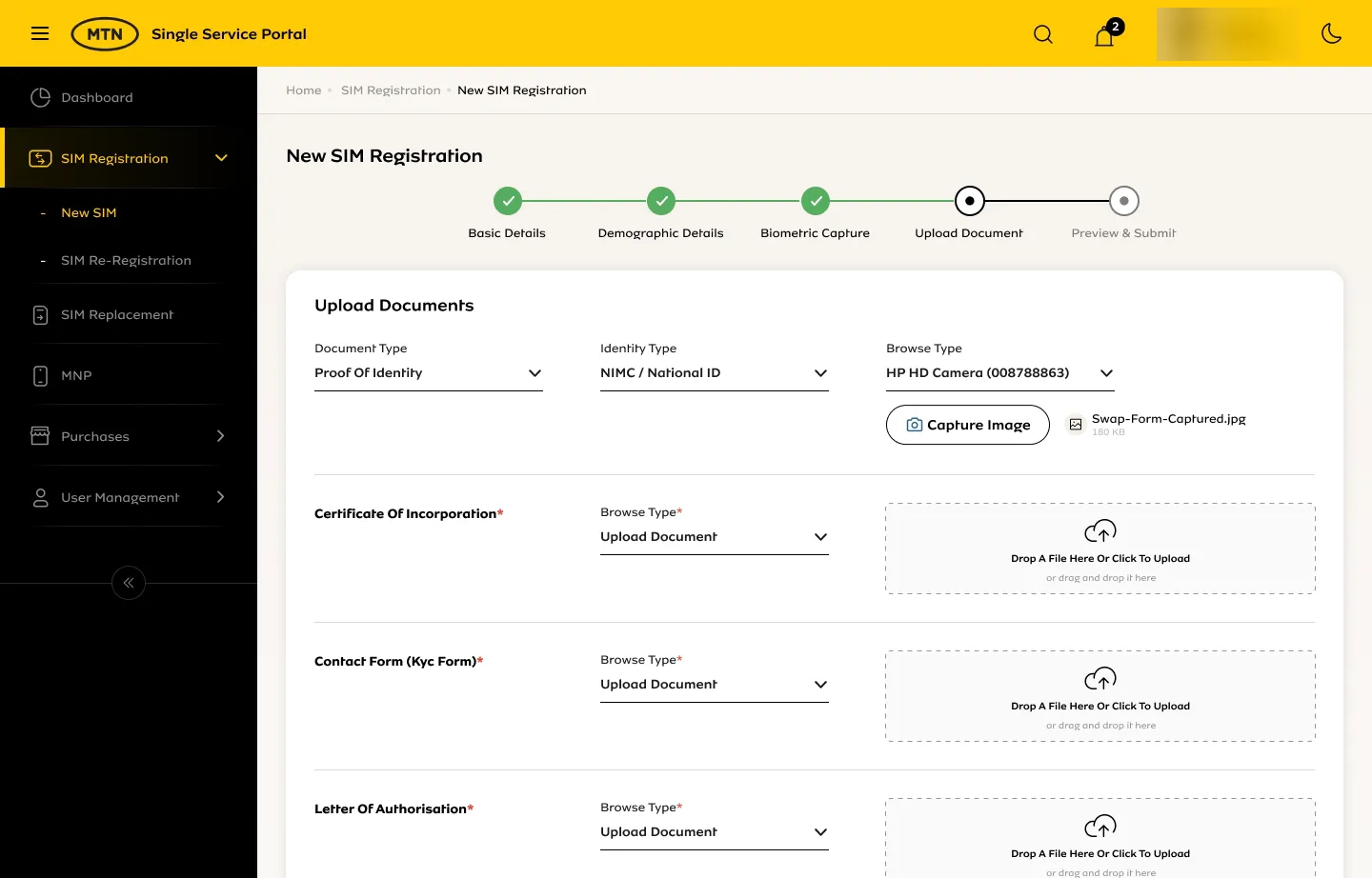
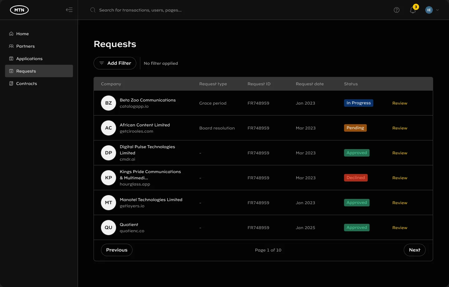
Two real MTN products from before Raanaa. Names and data blurred.
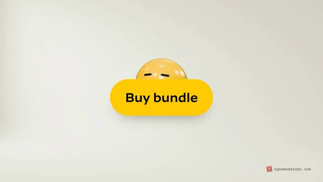
Four products, one "Buy bundle" button. They look the same until you inspect them, which is what the audit did.
Four buttons from one company, with four yellows, three radii, four heights and three text sizes.
Recreated from what the audit found: the same button in different MTN yellows, a pill in one product and an 8px radius in another, different heights and text sizes. Product names generalised.
| Name | Type | Priority | Why |
|---|---|---|---|
| Typography | Foundations | High | A type scale that works on mobile and desktop |
| Colours | Foundations | High | An accessible colour system for the brand |
| Spacing | Foundations | High | One spacing baseline for every design |
| Buttons | Components | High | The most rebuilt piece across products |
| Inputs, Select, Tables | Components | High | Every product's forms and lists depend on them |
| Brand, Illustrations | Principles | Low | Later, once the base held |
| And more, from the full audit | |||
The audit sheet. Everything we found went here, ranked so we built the foundations first.
A designer picked a value in Figma. A developer read it from Figma's inspect panel and typed it into code. Every re-type shifted a value slightly, and across products nothing matched.
So design and code needed the same names, leaving nothing to translate by hand.
Follow one yellow from Figma to the screen, before and after Raanaa.
#FFCB05#FFCB05#FFCC00primaryprimaryvariant="primary"Before: re-typing changed the yellow. After: one name, the same yellow on screen.
Recreated to show the pattern the audit found: the value was right in Figma and changed when it was typed again. Hex values illustrative.
Follow one colour, primary, from a raw value to the screen.
Built for this page from the design library's real values. SME Hive is MTN's, built with partners, so it runs its own theme on the same components. Its colours come from SME Hive's own design file: mint buttons, deep teal text and peach as the second colour. Its dark mode is our proposal from that palette: near-black, mint for actions and peach outlines.
Designers and developers pick from the same numbers, so "space 4" means 16px in Figma and in code.
53 components in the Figma library, built and documented with their variants and states. The six marked new are the latest additions.
Also: Empty States (in progress), Data Table and Page Layout templates, and pattern explorations.
We worked as equals in three-week agile sprints, with Ikedi Eze leading the design system. Most of the work was shared; these are the parts I shaped most closely.
What broke: accessibility. We designers ran our first components through BrowserStack's accessibility checks, and they failed. Since then, every component page in Figma carries an accessibility layer, so we check a component before it's built, and the tokens keep text on MTN yellow black.
A few of the components I worked on with the team. They're rebuilt here in Raanaa's MTN tokens, so you can try them.
9 components
↑︎↓︎ to switch
Rebuilt for this page from the Raanaa library, with MTN's real tokens. Sample data only.
Every page handles five states: loading, empty, no results, error and success. Layout patterns cover the pages we build most, and "never do" lists hold the common mistakes.
Then the people work: 1:1s with every team, office hours, async design reviews, a support channel, and developer champions inside each team. I ran design reviews and wrote documentation, which now lives in MTN's internal developer portal.
Three products adopted it first: the logistics portal, SME Ville and the Canvasser agent app.
One screen, five states. Every page in Raanaa plans for all of them before it ships.
Three products used the system at first. Now more than 20 do, including myMTN and eShop. About 15 designers and 40 developers use it. Below are screens from the first three products and the components in each.
Each component has a Figma version for designers and a code version developers can copy. Teams can start with those finished parts, so features ship much faster than they used to.
What I can show, and what I can't. Every designer on the team now designs with Raanaa. In a team meeting in October 2026, our senior developer estimated that building from the system in code has cut design-to-production time by about 40%. That's an estimate, not a tracked number, and there's still no clean before and after for UI bugs. Next: adoption against custom components, time to build a standard page, inconsistency bugs, and a quarterly survey.
Screens from the first products built on Raanaa. Pick a product, then a screen.
Real product screens from the teams' Figma files. Personal details blurred.
New products look and behave like one MTN.
Teams tell us they ship faster, with fewer UI fixes before release.
Quicker files, easier handovers, faster onboarding for new joiners.
Reusable components instead of the third date picker.
What teams have told us. The 40% is an estimate, see the note above.
A very exciting and forward-thinking bedrock. Very welcome.
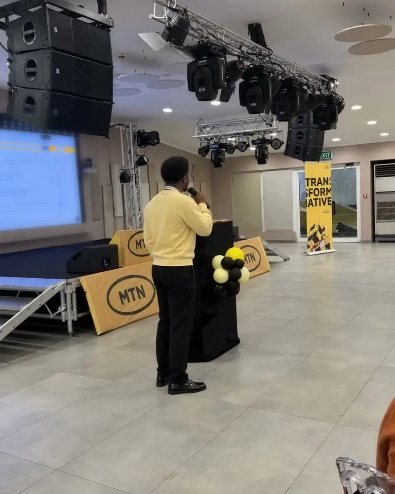
We presented Raanaa to other MTN operating companies, and they're looking at building the same for themselves.
Me, presenting Raanaa to other MTN operating companies. The projected screen is softened.
 FigmaComponents, tokens
 FigJamThe audit
 ClaudeDocs, writing